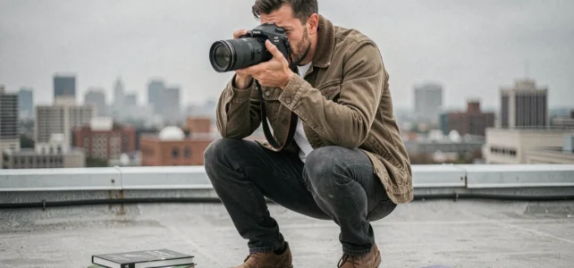
Framing in photography refers to the choice of what is included in the image and what is excluded. This choice depends on the distance to the subject, the orientation of the camera, and the focal length used. However, effective framing is not limited to applying a grid: it is also determined by the medium of distribution (large format print, Instagram story, web portfolio) and the narrative intention behind each photo.
The ten techniques that follow cover concrete situations, from tight portraits to aerial landscapes. For each, the selection criterion is the same: which framing best serves the visual message according to the shooting context?
You may also like : How to Optimize Your Community's IT Management with Innovative Solutions
1. Rule of thirds applied to horizontal landscape
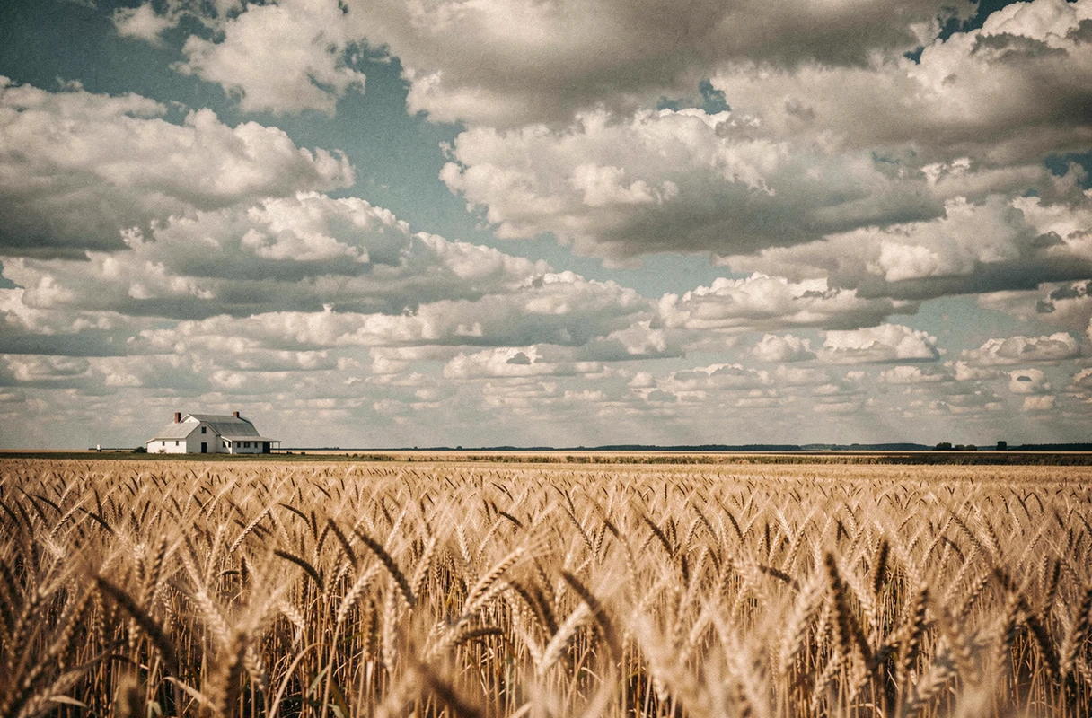
Dividing the frame into nine equal zones with two horizontal and two vertical lines remains the most reliable starting point in landscape photography. Placing the horizon line on the upper third adds depth to the foreground. Placing it on the lower third highlights a dramatic sky or a sunset.
You may also like : How and where to include military service on a resume to enhance your background
On a panoramic print or a website banner, this distribution effortlessly guides the viewer’s gaze. In contrast, for a square post on social media, the rule of thirds loses its effectiveness: the compressed format reduces the available space, and it is better to center the subject.
Among the examples of effective photographic framing found in landscapes, this placement on the thirds works particularly well when the foreground contains a textured element (rocks, grass, water).
2. American shot for editorial portrait
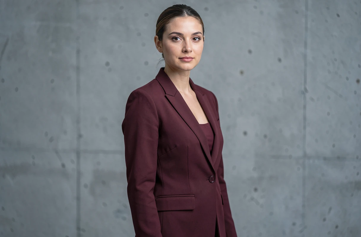
The American shot cuts the subject at mid-thigh. This framing shows both the posture, the outfit, and part of the background. It is suitable for editorial portraits intended for the press or fashion lookbooks.
Its main advantage: it leaves enough space around the subject to integrate text in post-production (magazine title, caption). For full-width web use, this shot offers a good balance between context and human detail.
3. Tight framing on the face for stories and vertical formats

A tight framing (from chin to forehead, or even tighter) focuses all attention on the expression. The eyes, skin texture, and micro-expressions become the main subject.
This shot works remarkably well in a 9:16 format, that of stories and Reels. The verticality of the medium amplifies the closeness. On a framed square print, the same framing can seem suffocating: the face lacks space around it. Therefore, the choice of the final medium determines whether this tight shot will enhance the portrait or constrain it.
4. Leading lines to guide the gaze in a street scene
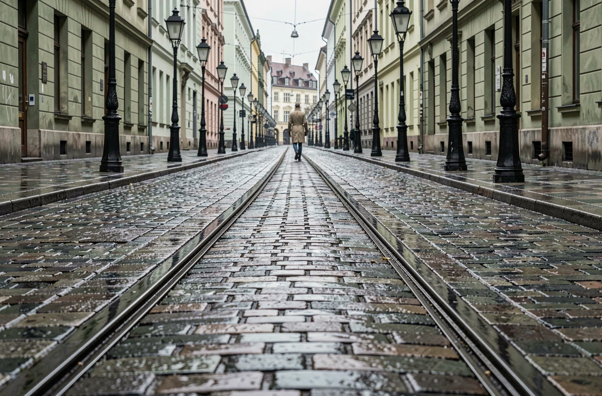
Leading lines (roads, ramps, rows of trees, walls) create a visual path that draws the viewer towards the main subject. In street photography, they add depth to a scene that would otherwise be flat.
The vanishing point works best when it starts from a corner or edge of the frame and converges towards a point located on a third. A common mistake is to multiply lines without hierarchy: the gaze disperses instead of focusing.
5. Frame within a frame with architectural elements

Using a door, window, arch, or branches as an inner frame isolates the subject and adds a layer of reading to the image. This technique enhances the perceived depth of field even at a wide aperture.
For a web portfolio or an online gallery, the frame within a frame produces immediately readable thumbnails. The subject stands out from the vignette due to the contrast between the dark foreground and the illuminated area in the center.
6. Total overhead shot for graphic compositions

Photographing strictly from above (flat lay) removes perspective and transforms the scene into a graphic composition. This framing is suitable for product photos, recipes, accessories, or editorial setups.
Total overhead shots require diffuse and even lighting to avoid distracting shadows. The background becomes as important as the photographed objects, which necessitates a deliberate choice of texture and color for the medium.
7. Low angle to dramatize an architectural subject
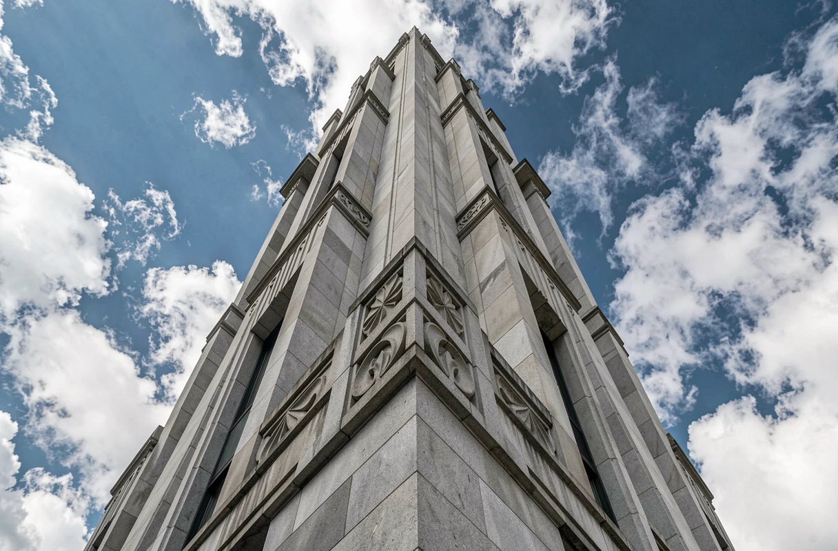
The low angle shot (camera tilted upwards) amplifies the height and power of the subject. In architecture, it transforms an ordinary building into an imposing structure.
On a large vertical print, this perspective effect is striking. On a reduced photo for an Instagram feed, the distortion of the verticals can become confusing. A slight cropping in post-processing, correcting the convergence of lines, restores balance without losing the dramatic effect.
8. Negative space for a minimalist rendering
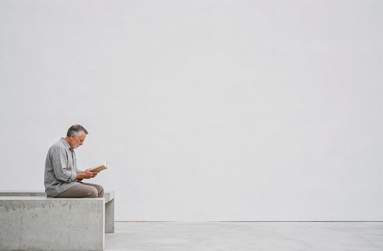
Leaving a large empty area around the subject creates a negative space that paradoxically draws the gaze towards the isolated element. This framing is suitable for advertising visuals where text will be added, and for large format canvas prints.
The challenge lies in the dosage. Too much empty space on a small smartphone screen gives the impression of a poorly framed photo. Adapting the proportion of emptiness to the final medium is key.
9. Central symmetry for reflections and architecture
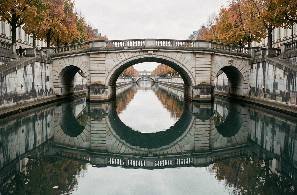
Placing the axis of symmetry exactly in the center of the frame goes against the rule of thirds, but symmetry produces a sought-after effect of calm and order in architectural and landscape photography with reflection.
This framing works when the symmetry is almost perfect. A slight break (a bird, a branch) on one side is enough to break the rigidity without destroying the balance. On a square print, central symmetry reaches its full visual potential.
10. Blurred foreground to add depth in environmental portrait
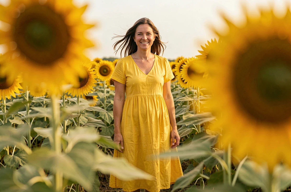
Placing a blurred element (foliage, fencing, curtain) between the lens and the subject creates a foreground that adds a layer of depth. The sharp subject naturally stands out from this textured environment.
This framing is suitable for environmental portraits intended to tell a story: the foreground gives a hint of place or atmosphere. For a corporate portrait intended for a website, this blurred foreground may distract. The narrative intention must guide the choice: documenting a context or isolating a person.
Framing is not just a grid imposed on every image. Each technique presented here responds to a specific use, related to the photographed subject and the medium of distribution. Testing a framing while first considering where the photo will be viewed remains the most useful reflex for improvement.